I think everyone should know the story of the Gilroy font creator because this font is not just a simple style of letters. It is a full design journey that inspires me and many other people who love creativity.
When I first saw the Gilroy font, I felt that it was clean, bold, and very modern. I started to explore who made it and how it became so popular. In this article, I will share what I learned and what we should know if we want to use this font in our own projects.
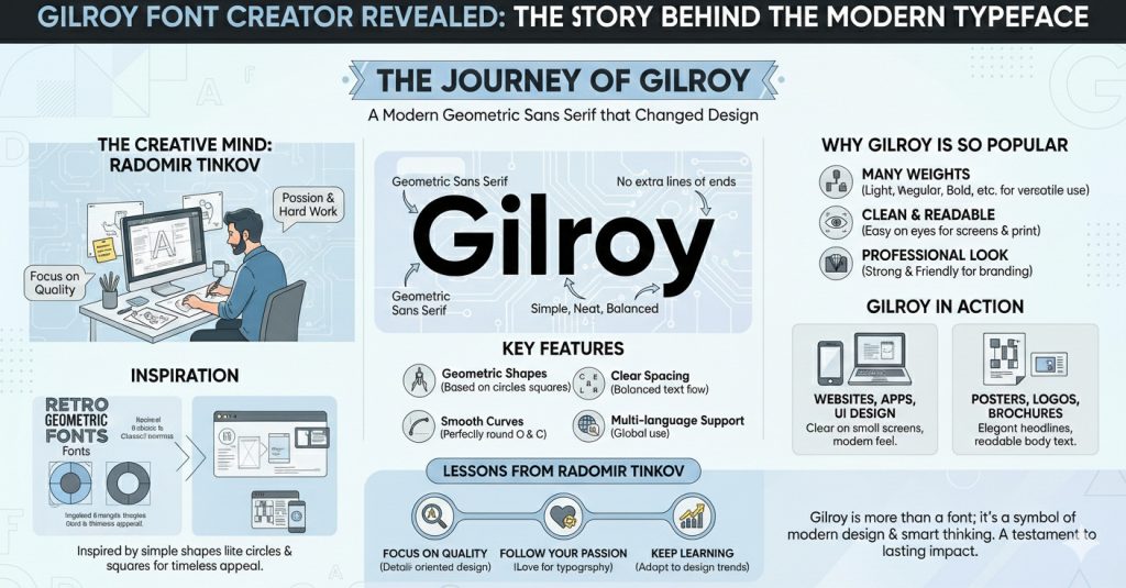
What Is Gilroy Font
Gilroy is a modern sans serif typeface. Sans serif means that the letters do not have small extra lines at the ends. The design looks simple and neat.
When we see Gilroy, we feel that it is strong and friendly at the same time. That is why many brands are using it for logos, websites, posters, and social media posts.
I remember when I was working on a small project for a friend. I needed a font that was modern but not too fancy. Then I tried Gilroy. When I typed my text in Gilroy, I felt that this is the one. The letters were clear and easy to read. That is when I started learning about the Gilroy font creator.
Who Is The Gilroy Font Creator
Radomir Tinkov is the creative mind behind Gilroy font. He is a professional type designer who loves to create beautiful and useful fonts. When I read about him, I understood that great fonts are not made in one day. They are made with hard work, practice, and passion.
Radomir Tinkov created Gilroy as a geometric sans serif typeface. Geometric means that the letters are based on simple shapes like circles and squares. This makes the font look balanced and clean. I feel that he wanted to create a font that can be used everywhere.
If you look at Gilroy carefully, you will see that each letter is carefully designed. That is why it looks so perfect.
The Inspiration Behind Gilroy
Every creator needs inspiration. I believe that Radomir Tinkov was inspired by modern design trends and classic geometric fonts. He wanted to design something that feels fresh but also timeless.
When we use Gilroy, we feel that it is new and stylish. At the same time, it does not look strange or hard to read.
I think that if a designer wants to create a successful font, they should understand what people need. People need fonts that are readable on screens and also look good in print. Gilroy does both very well. That is why it became popular in a short time.
Why Gilroy Font Is So Popular
There are many reasons why Gilroy is popular.
1. Many Weights Weight means how thick or thin the letters are. Gilroy has light, regular, medium, bold, and many more styles. This means we can use it for headings and also for small text.
2. Clean and Readable When we read text in Gilroy, our eyes do not feel tired. That is very important for websites and apps.
3. Professional Look If you are starting a business and you want your brand to look strong, you should choose a font that gives a good impression. Gilroy does that very well.
My Personal Experience With Gilroy
When I started learning graphic design, I was confused about fonts. There are thousands of fonts online. I did not know which one to choose. Then I learned that choosing the right font is very important.
One day I downloaded Gilroy and tried it on a logo design. The result surprised me. The logo looked clean and modern. My client was happy. That day I understood that a good font can change everything.
After that, I used Gilroy in social media posts, banners, and even presentations. Every time it looked balanced and attractive. I felt more confident in my design skills.
Features Of Gilroy Font
Gilroy has many strong features:
- It has geometric shapes, which make the font look modern.
- It has smooth curves. Letters like O and C are perfectly round.
- It has clear spacing. The space between letters is balanced.
- It supports many languages, so people from different countries can use it.
- It has many weights and styles, giving freedom in design.
If you are a beginner, you should try Gilroy because it is easy to work with and does not create confusion.
How Gilroy Helps In Branding
Branding is very important for any business. A brand is not only a logo; it is the full image of a company. Fonts play a big role in branding.
But if a brand uses a clean and modern font like Gilroy, people feel that the company is serious and professional.
I have seen many startups using Gilroy. Their websites look simple and elegant. When we visit such websites, we feel comfortable reading the content. That is the power of good typography.
What We Can Learn From The Gilroy Font Creator
There are many lessons that we can learn from Radomir Tinkov.
1. Focus on Quality He did not create a random font. He worked carefully on every letter.
2. Follow Your Passion If he did not love typography, he would not create such a popular font.
3. Keep Learning Design trends change every year. If we want to stay successful, we must improve our skills.
If we follow these lessons, we can also create something valuable.
Gilroy Font In The Digital World
Today most content is online. Websites, apps, and social media are everywhere. Fonts must look good on screens, and Gilroy is perfect for digital use.
The letters are clear even on small mobile screens. The shapes are simple, so they load well on websites. Designers choose Gilroy for user interface design because it looks modern and friendly.
When I designed a simple blog layout, I used Gilroy for headings and body text. The result was clean and easy to read. My friends told me that the website looked professional. That made me happy.
Gilroy Font In Print Design
Gilroy is not only good for digital use; it also looks great in print. Posters, brochures, business cards, and magazines can use Gilroy.
The bold weights are strong for headlines. The light weights are soft for body text. This balance makes print designs look elegant.
If you are making a school project or a small business flyer, you should test Gilroy. It may give your work a fresh look.
Challenges In Creating A Font
Many people think that it is just drawing letters, but it is much more than that.
A designer must think about spacing, curves, thickness, and readability. Every letter must match with others.
I respect Radomir Tinkov because creating a full font family with many weights requires patience and skill.
Why Simplicity Wins
One big reason behind Gilroy’s success is simplicity. The design is simple but powerful.
Simple designs are easier to understand. When people visit a website, they do not want to struggle reading text. They want clarity.
Gilroy gives clarity. That is why many designers love it.
Future Of Gilroy Font
I believe that Gilroy will stay popular for many years. Trends change, but clean geometric fonts are always useful.
If new designers are learning typography, they should study fonts like Gilroy. They can understand how balance and spacing work.
I also think that more brands will adopt this style because it fits modern design needs.
My Advice For New Designers
If you are starting your design journey, do not ignore typography. Fonts are very important.
Practice using different fonts and compare them. See how they change the mood of your design.
Study the work of professional type designers like Radomir Tinkov. Understand how they think and create.
We should always try to improve. With practice and patience, we will see growth.
FAQ
What is Gilroy font?
Gilroy is a modern geometric sans serif font created by Radomir Tinkov. It is used for branding, websites, and print design.
Who is the Gilroy font creator?
The Gilroy font creator is Radomir Tinkov, a professional type designer known for clean and modern fonts.
Why is the Gilroy font popular?
Gilroy is popular because it is clean, readable, modern, and available in many weights. It works well in digital and print projects.
Is Gilroy good for beginners?
Yes, it is good for beginners because it is easy to use and looks professional even in simple designs.
Should we use Gilroy for branding?
Yes, we should use Gilroy for branding if we want a modern and trustworthy look. It helps create a strong visual identity.
Can Gilroy be used on websites?
Yes, Gilroy can be used on websites because it is clear and readable on screens.
What can we learn from the Gilroy font creator?
We can learn that hard work, passion, and attention to detail are important if we want to create something successful.
Conclusion
The story of the Gilroy font creator inspires me a lot. It shows that passion and hard work can create something that the whole world uses. Gilroy is not just a font. It is a symbol of modern design and smart thinking.
I learned that choosing the right font can change the look of any project. If we want our designs to look clean, professional, and modern, we should consider Gilroy.
I hope that this article helped you understand who created Gilroy and why it is important. If you are a student or a beginner designer, do not feel afraid to explore typography. With practice and patience, you can also create something amazing.