Meta Description
I think this guide helps you understand sans serif font examples in a simple way so we learn how these fonts look and how we use them to create clean and readable designs easily
I think fonts play a very important role in design and reading. When I started learning about fonts I noticed that some fonts look clean and easy while others feel heavy. Sans serif fonts were the first fonts that helped me understand clean design. I think that if we want our text to look modern and easy then we should learn about sans serif font examples.
In this guide I will share my personal experience and explain everything in a very simple way. We will learn what sans serif fonts are, how they look and where we should use them.
What Are Sans Serif Fonts
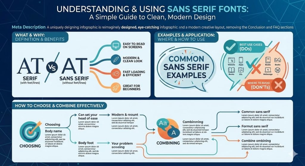
I think sans serif fonts are fonts that do not have extra lines at the ends of letters. These fonts look smooth, clean and straight. If you look at letters like A or T you will see that there are no small decorations.
We use sans serif fonts because they are easy to read on screens. Phones, computers and websites mostly use these fonts.
Why Sans Serif Fonts Are So Popular
I think these fonts are popular because they are simple and modern. Many big brands use them because they look professional.
Sans serif fonts are popular because They are easy to read They look clean They work well on screens They feel modern
If we want clear communication then we should use these fonts.
Common Sans Serif Font Examples
I think examples help us understand better. These are some common sans serif fonts that many people use.
Arial Helvetica Verdana Tahoma Calibri Roboto
These fonts are used in websites, apps, documents and mobile screens.
How Sans Serif Fonts Look
I think sans serif fonts look straight and balanced. Letters feel open and friendly. If text is small these fonts still stay readable.
That is why we see them everywhere online.
Where We Should Use Sans Serif Fonts
Websites
Sans serif fonts are best for websites because they load fast and read easily.
Mobile Apps
Phones use these fonts because screens are small.
Presentations
Slides look clean and professional.
Social Media
Text becomes easy to read on posts and banners.
User Interfaces
Menus buttons and labels use these fonts.
Where We Should Avoid Sans Serif Fonts
We should avoid sans serif fonts in Traditional books Formal invitations Classic designs
If the design needs an old style feel then serif fonts are better.
My Personal Experience With Sans Serif Fonts
I think learning from experience helps most. When I first made a website I used a fancy font. Then I changed the font to a sans serif style and everything improved.
Users stayed longer Reading became easy The site looked modern
That is when I understood the power of simple fonts.
How Sans Serif Fonts Help Beginners
I think beginners should start with these fonts.
They are easy to use They look good everywhere They reduce mistakes They teach balance
If you are learning design you should start here.
How To Choose The Right Sans Serif Font
I think we should ask simple questions.
Is it easy to read Does it fit the design Does it look clean Is it simple
If answers are yes then the font is good.
Sans Serif Fonts For Long Text
I think sans serif fonts are good for long text on screens. Blogs, articles and guides look better when text is simple.
Readers do not feel tired Eyes stay relaxed Content feels friendly
Sans Serif Fonts And SEO
I think design affects SEO indirectly.
Good readability Better user time Lower bounce rate More engagement
If users stay longer Google notices that.
How To Combine Sans Serif Fonts
I think combining fonts helps design.
Use one sans serif font for body text Use another for headings
This keeps design clean and interesting.
Are Sans Serif Fonts Free
I think many fonts are free.
Google Fonts offer many options Some fonts need license
We should always check usage rules.
Why Sans Serif Fonts Are Best For Modern Design
I think modern design needs clarity.
Sans serif fonts offer Clean look Simple shapes Fast reading Modern feel
That is why designers love them.
Sans Serif Fonts For Students
I think students should use these fonts.
Notes look clear Assignments read easily Presentations improve
They help with learning.
Sans Serif Fonts For Business
I think businesses need trust.
These fonts look Professional Clear Strong
That is why brands use them.
FAQ
What are sans serif fonts?
They are fonts without extra lines on letters.
Are sans serif fonts easy to read?
Yes they are very easy especially on screens.
Should beginners use sans serif fonts?
Yes they are perfect for beginners.
Are these fonts good for websites?
Yes, most websites use them.
Can we use sans serif fonts everywhere?
They are good for most modern designs.
Conclusion
I think sans serif font examples help us understand modern design in a simple way. We learned what these fonts are, how they look and where we should use them. From my experience I can say that if we want clean, readable and professional designs then sans serif fonts are the best choice.
We should keep designs simple and focus on user comfort. This guide gives you clear information and practical ideas so you can use sans serif fonts with confidence and improve your design work easily.